Consumer Product Strategy / UX Research
TikTok / Retok
A redesign that makes saved videos easier to organize, search and actually come back to.

- Project type
- Independent product redesign — not affiliated with TikTok
- Status
- Independent concept
- My role
- Research, product strategy and UX design (solo)
- Team
- Independent
- Tools
- User interviews, competitive analysis, user flows, interactive prototypes
The result
A prioritized product opportunity and an interactive prototype for tag-based filtering and lighter-weight collections.
The opportunity
Favorites turns into a junk drawer.
People save videos constantly — recipes, workouts, things to show a friend. But the Favorites tab is a long, flat grid. The more you save, the harder it gets to find anything, and saved videos quietly stop being useful.
That gap between saving and rediscovering felt like a real product opportunity: content people already chose to keep, sitting unused.
Discovery
How people save — and lose — things
I interviewed users with different levels of TikTok usage, looked at how they save, organize and revisit content, and compared other apps' approaches to organizing saved content.
Search
Finding is the hard part
Saving is instant, but there's no good way to search your own saves.
Organization
Collections take effort
Manual collections ask for upfront sorting work that most people skip.
Re-engagement
Out of sight, out of mind
Once a video scrolls out of view in Favorites, it's rarely seen again.
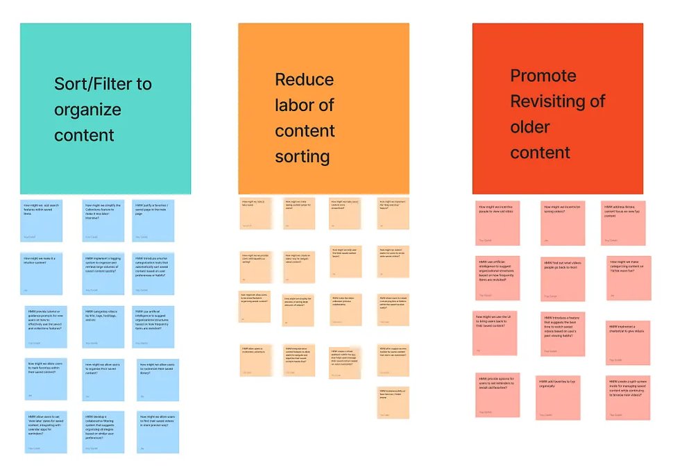
Ideation
Three solution spaces, one direction.
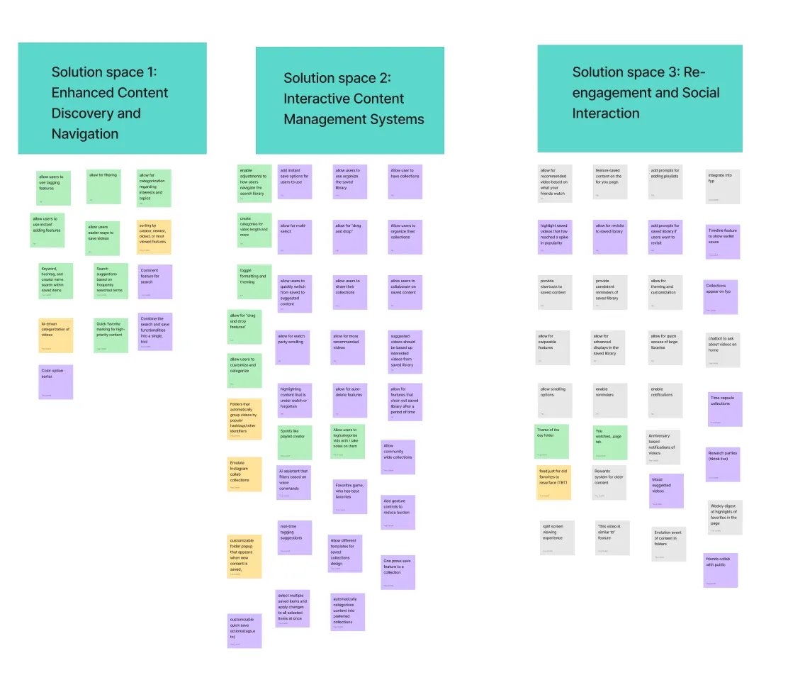
We brainstormed widely across three spaces: better discovery and navigation, more interactive ways to manage saves, and features that bring old content back.
Tagging, filtering and low-effort collections showed up in all three, so that's where we focused.
Product decisions
Less sorting, more finding.
Tag-based filtering by creator, keyword, mood and topic
Instead ofMore folders
Filters match how people remember a video, without asking them to file it first.
Lighter-weight collections
Instead ofFully manual collection building
Lowering the effort to organize makes it more likely to happen at all.
Designing for rediscovery
Instead ofTreating Favorites as storage only
Saved content only has value if it resurfaces when it's useful.
Planning
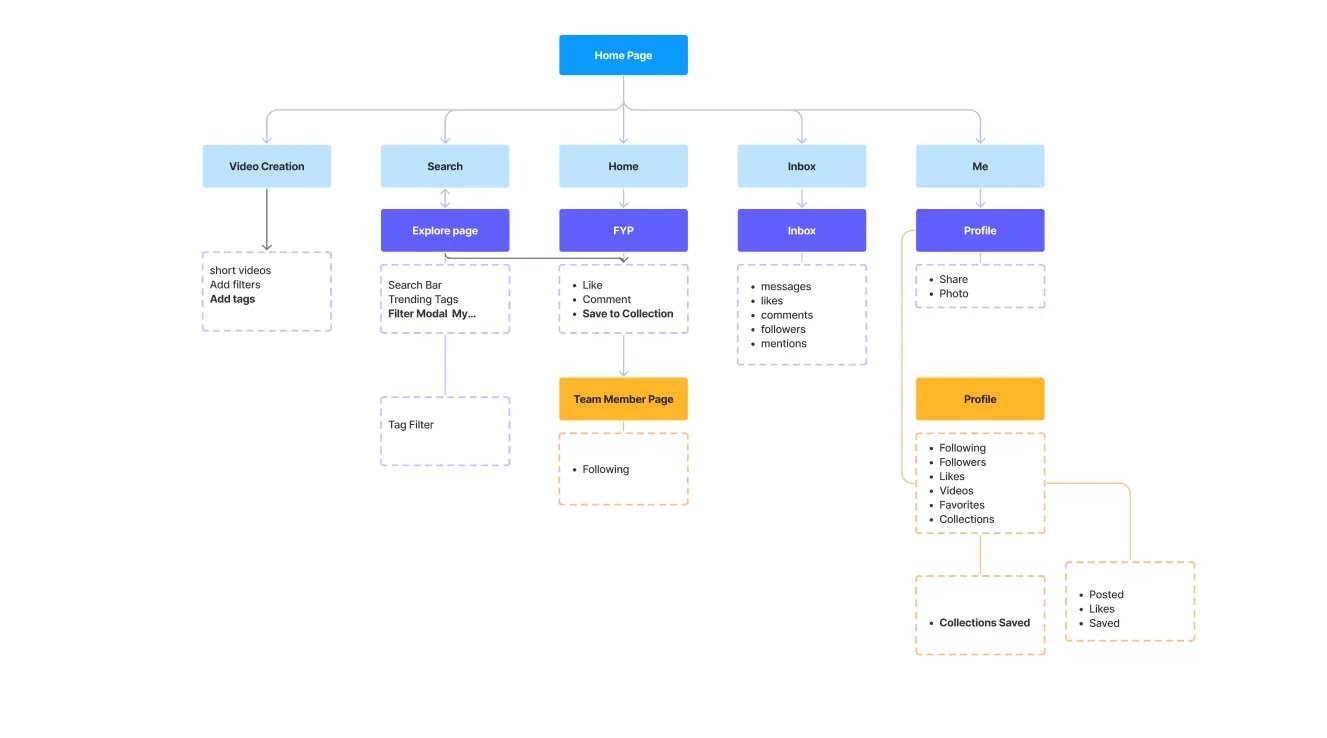
Where tags and collections live.
Before designing screens, we mapped the app to find the few places the feature needed to touch: tags when posting, a tag filter in search, saving to a collection from the feed, and collections on the profile.
Mid-fi to high-fi
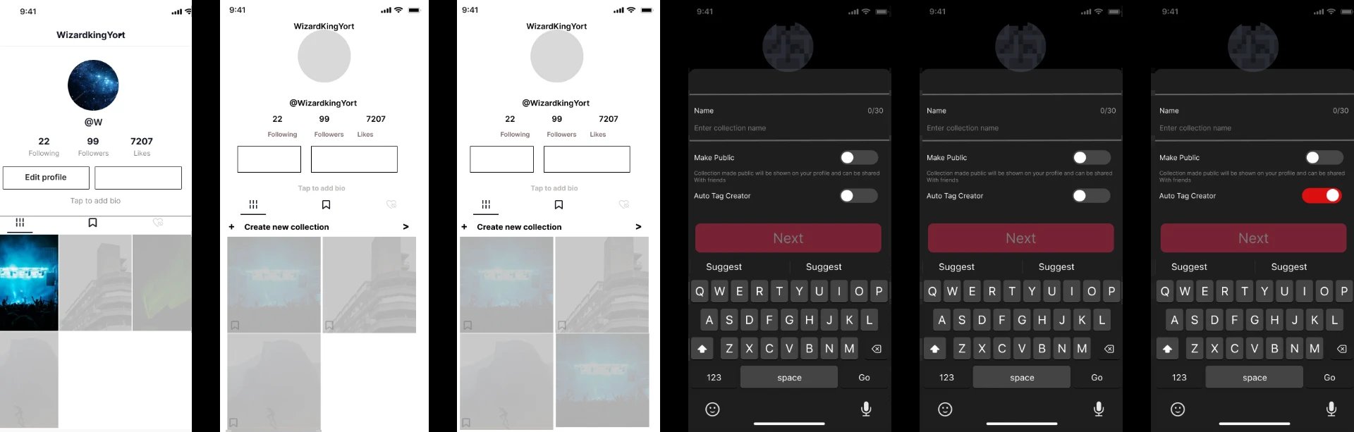
From wireframes to working screens.
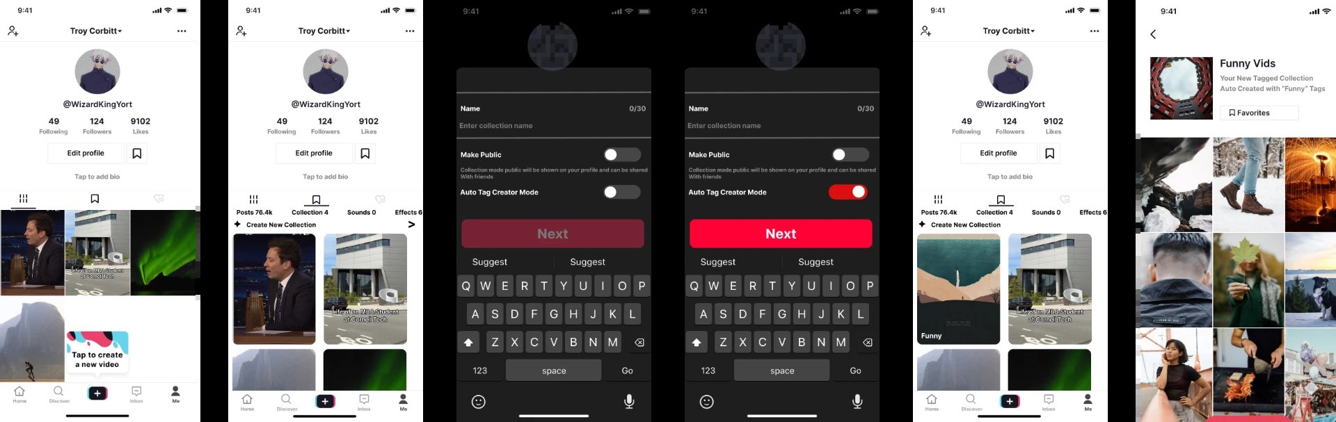
The core flow: creating a collection that fills itself using tags. It started as a grayscale wireframe and was refined into high-fidelity screens.
Demo
See it in action.
A walkthrough of the prototype: tagging a post, then finding it again through an auto-tagged collection.
Testing & iteration
Refined with feedback.
I built user flows and interactive prototypes, put them in front of people, and refined the solution based on their feedback. The full walkthrough — research, flows and prototype — is in the Medium write-up.
Outcomes
Where it landed.
- What was built
- Research synthesis, user flows and an interactive prototype for a redesigned Favorites experience.
- Evidence
- User interviews, competitive comparison and feedback on the prototype.
- Limitations
- A concept — no access to TikTok's data, and not tested with real usage at scale.
What I'd measure next
- Share of saved videos that get revisited
- How often searches within saves succeed
- Whether people create and keep using collections
Next project
Viewpoint Vault
Creating space for perspectives that go unheard.
Open to Product · Product Design · UX Research · Tech roles